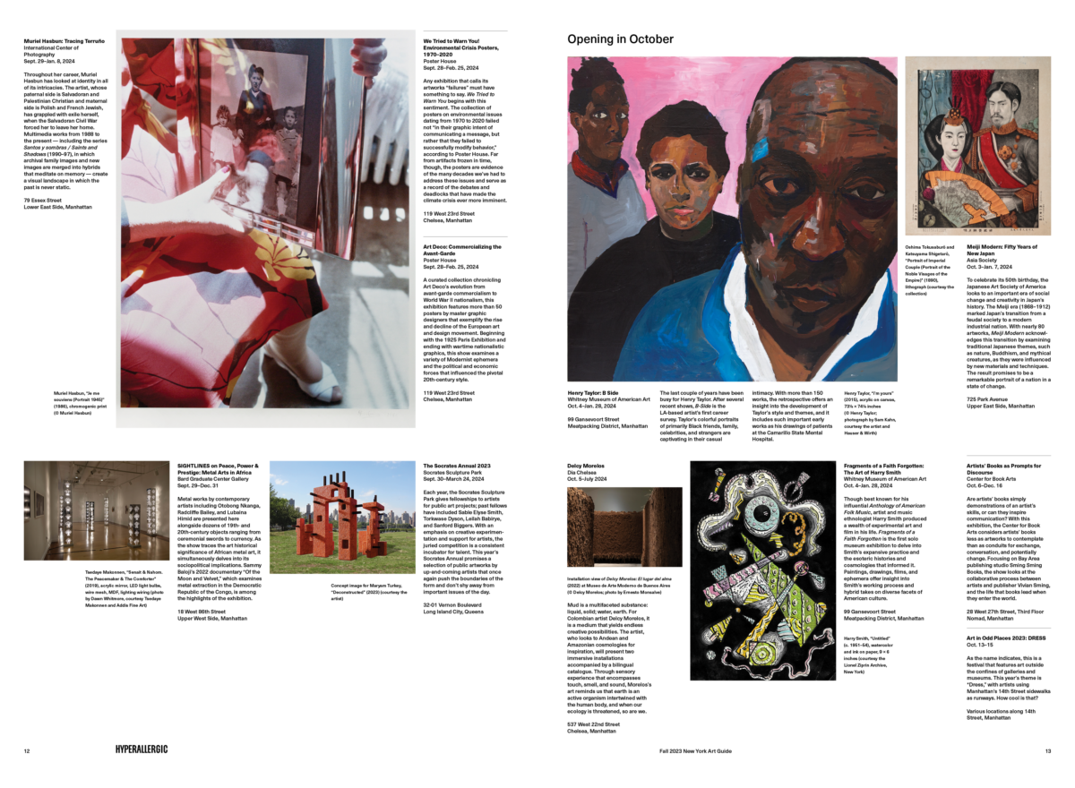
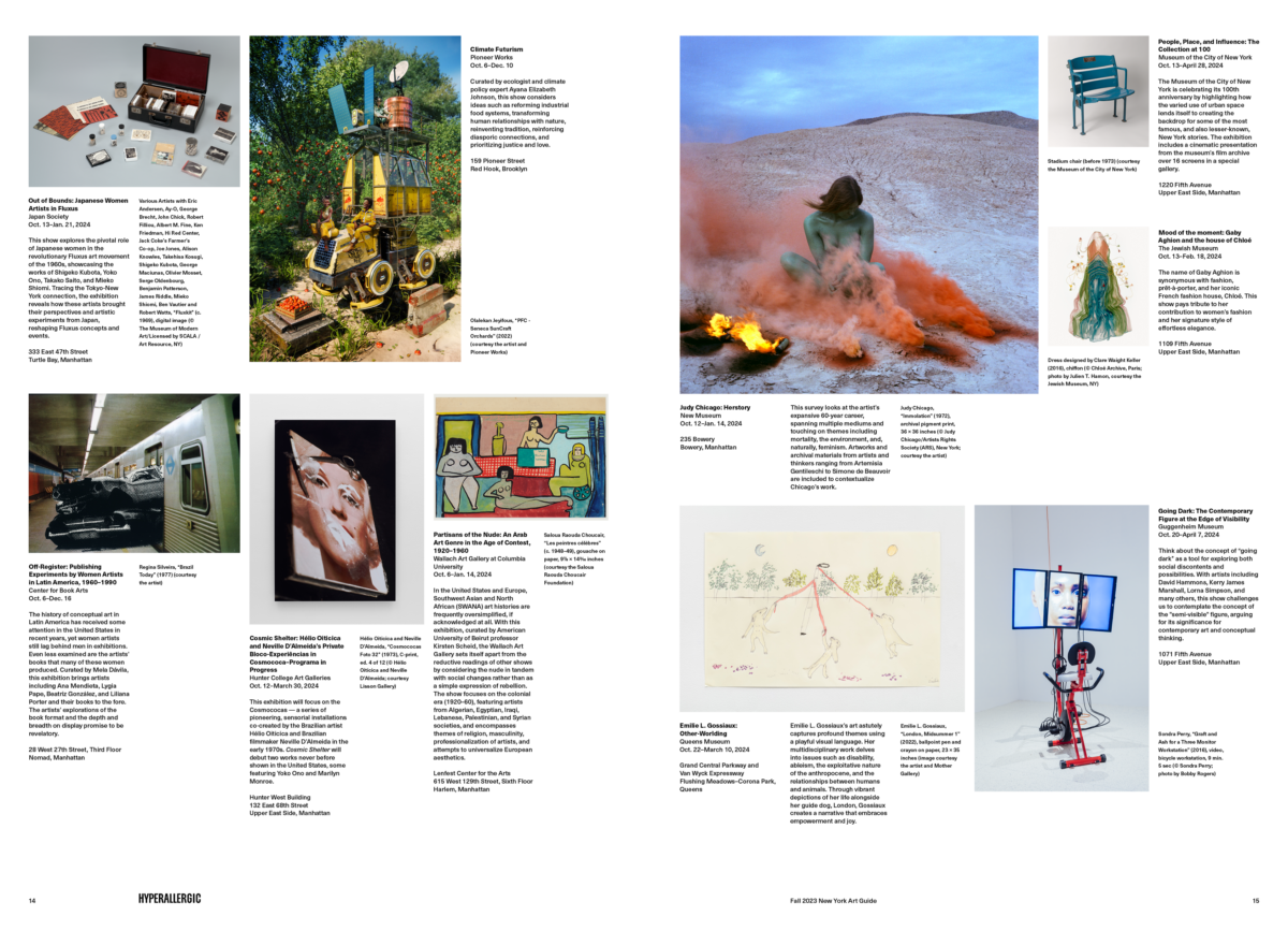
Hyperallergic Art Guides
New York, 2019—2024
A seasonal newsprint guide of must-see, fun, insightful, and very New York City (and sometimes Los Angeles, Upstate New York, Connecticut and Long Island) art events compiled and edited by Hyperallergic.
I have designed art guides with the amazing and fiercely independent editors at Hyperallergic for the last decade with the exception for a pause during the pandemic. We iterate, of course, on each issue but also refresh the overall design every couple of years and did so in 2022 when the New York art world emerged from pandemic slow downs.
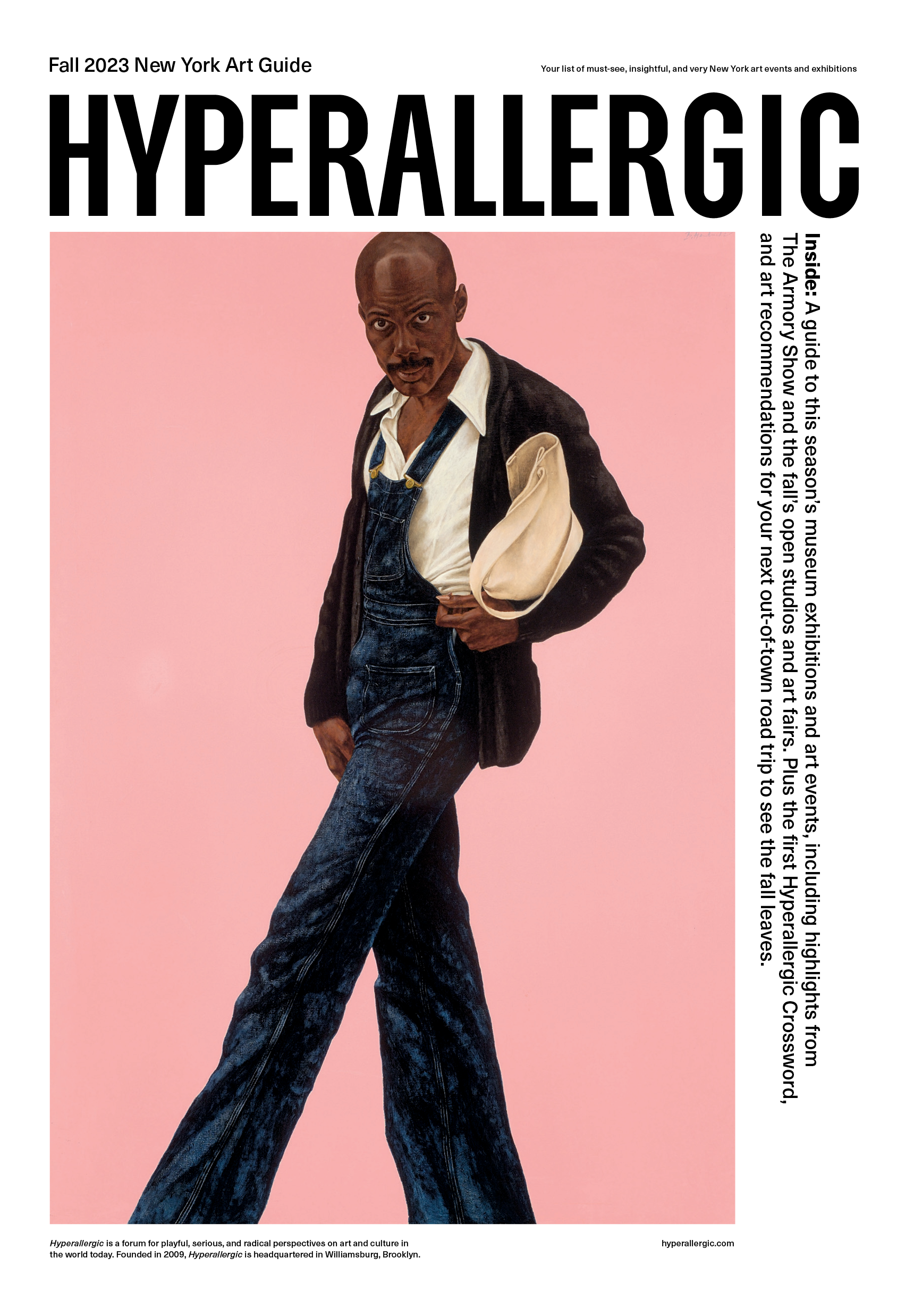
Rethinking the front page was our first task. The guide is given away so the editors wanted the Hyperallergic wordmark to be fully visible when the paper was folded. And I was not happy with the tone set by the front page typography and layout from our 2019 refresh — it was bit fussy and rigid with too many type styles. (It worked in 2019 but after the pandemic we were craving something more straight forward, solid and reflective of the writing.) The adjustments were simple but by placing the wordmark across the top and reducing the amount of type and typographic variation the page became more graphic, bold and image-forward.
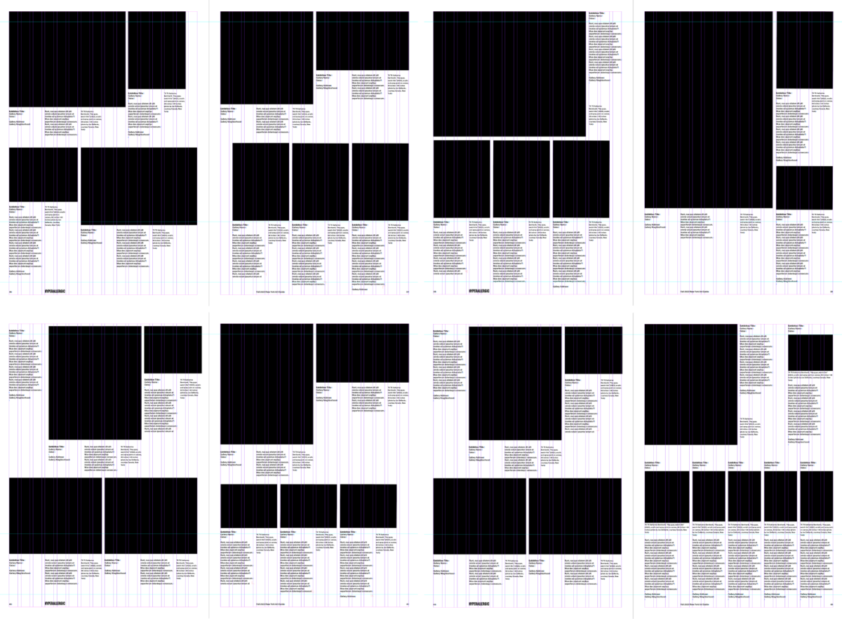
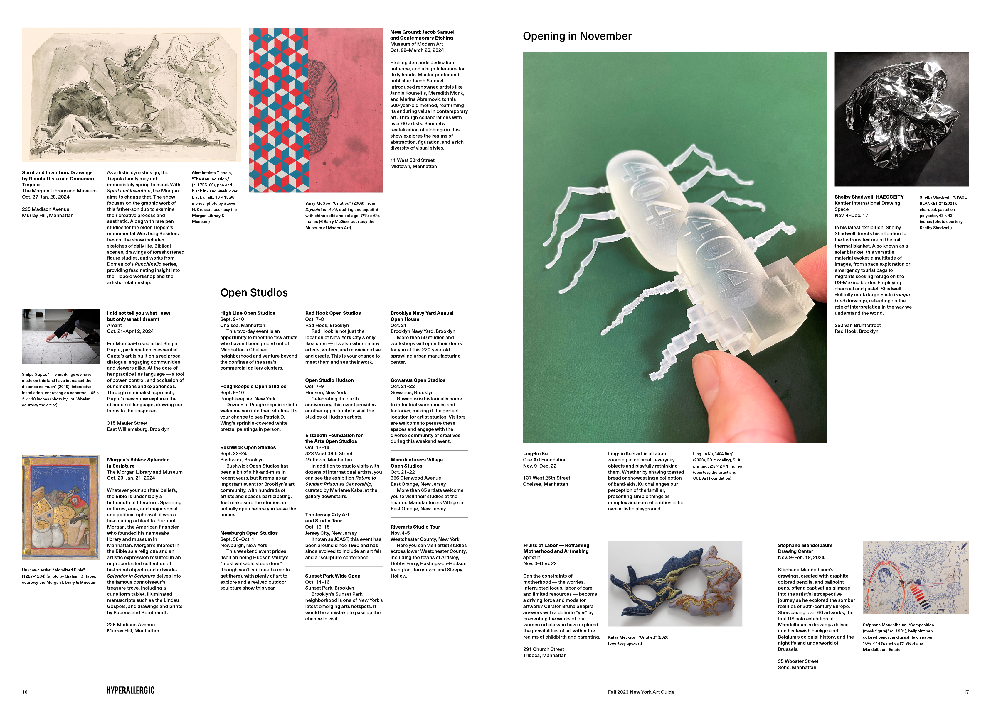
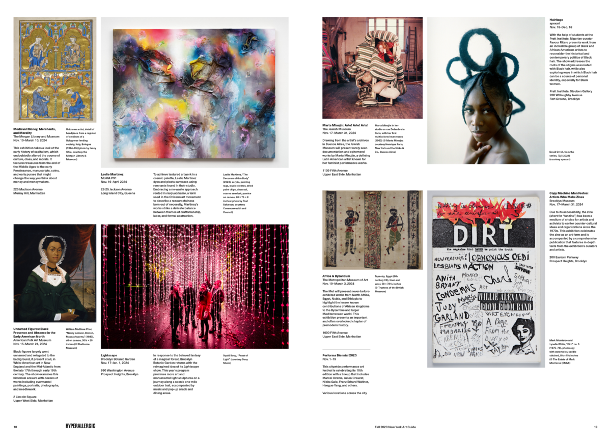
The insides were a bit more challenging. The main goal was to create dynamic spreads that were easy for a reader to scan but not feel overly templated. There were several constraints:
- We should present the exhibitions in roughly chronological order.
- We should retain the proportions of the art work.
- We needed flexibility with image emphasis, calibrating based on editorial and aesthetic value.
- We wanted the exhibition description to be near it’s associated image. Previously we listed exhibitions in columns and had a well of imagery collages. It looked great and was easy to produce but it challenged the reader to connect description with imagery.
- We wanted more density — more exhibitions per page — while still showcasing the great imagery.
- And of course the layouts should be easy to adjust without having to reflow the entire guide.
Another wrinkle was the fact that my version of Univers, which Hyperallergic has used as a workhorse typeface since they started, was no longer supported in Adobe Indesign. (I will leave you to guess Univers’ replacement.)
The approach I took was to develop a half dozen patterns that represented the variety we typically see each season. With the patterns I designed sample spreads that provided a rough guide to actual layouts although I was very careful to prioritize how the spread felt even if it broke the system.
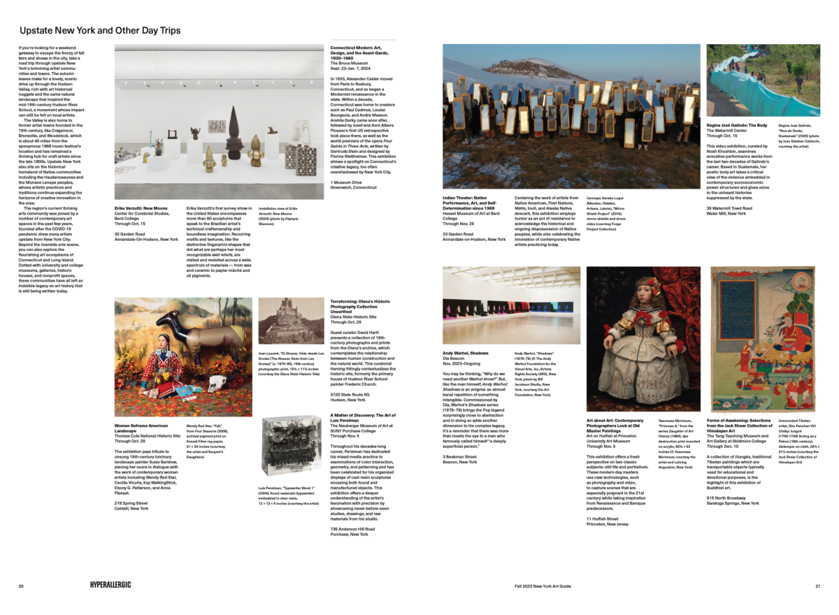
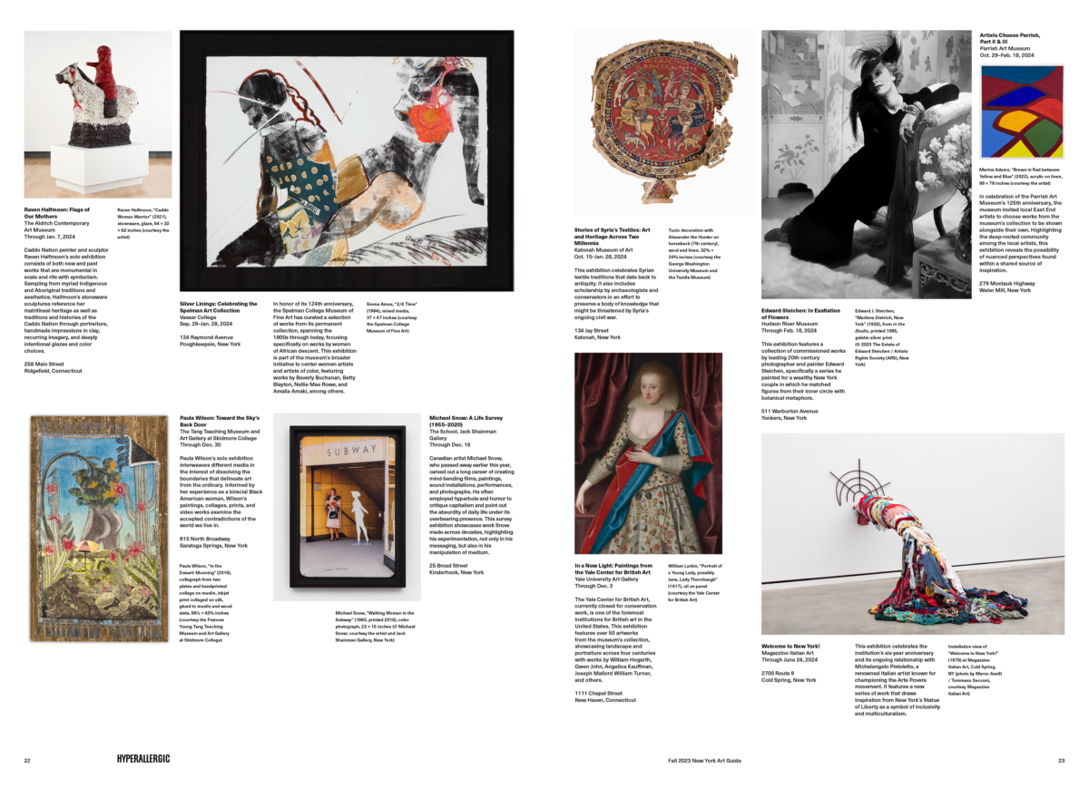
The following is the majority of the spreads from the Fall 2023 guide.
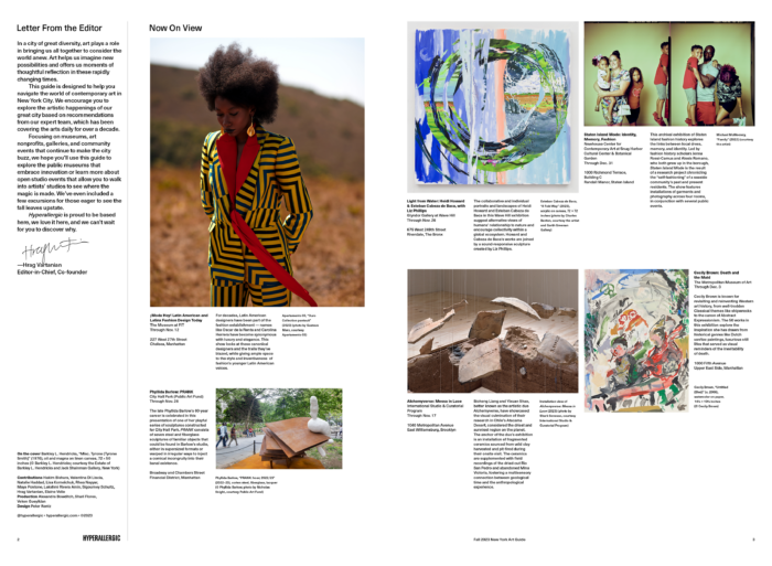
The page count varies based on the season (Fall 2023 was 24 pages) but the size is always 810pt × 1188pt and usually folded in half for distribution. The paper is mid-grade newsprint and is printed CMYK at Linco Printing in Queens NY.